


Open Tabs is a newsletter from one disorganized designer as I attempt to organize and close my many open tabs.

One of the occupational hazards perks of being a graphic designer is that I see a lot of fonts. I swipe left, swipe right, fall in love with them hard and and fast and wish that I could remember all their faces, but at the tender age of 34, I no longer have the ability to effectively catalog fonts in my brain (that space is over capacity and shrinking). As an effort to make note of the fonts that I met and want to see again, I’m (re)starting the practice of creating font roundups here on Open Tabs.
Every month, I’ll share a curated selection of fonts that I tried that past month and loved. Some of the fonts will be new-to-me, others, bangers that I’ve come back to that I can’t believe I’d forgotten even for a second.
I’ll always try to include a typeface available on Adobe Fonts as well as a free, open-source font. My hope is that in a world of endless type choices, these roundups serve as a reference for you (and me!) to find the right, usable fonts for a given project. Without further ado, here’s the roundup for February!
01. ITC Cushing
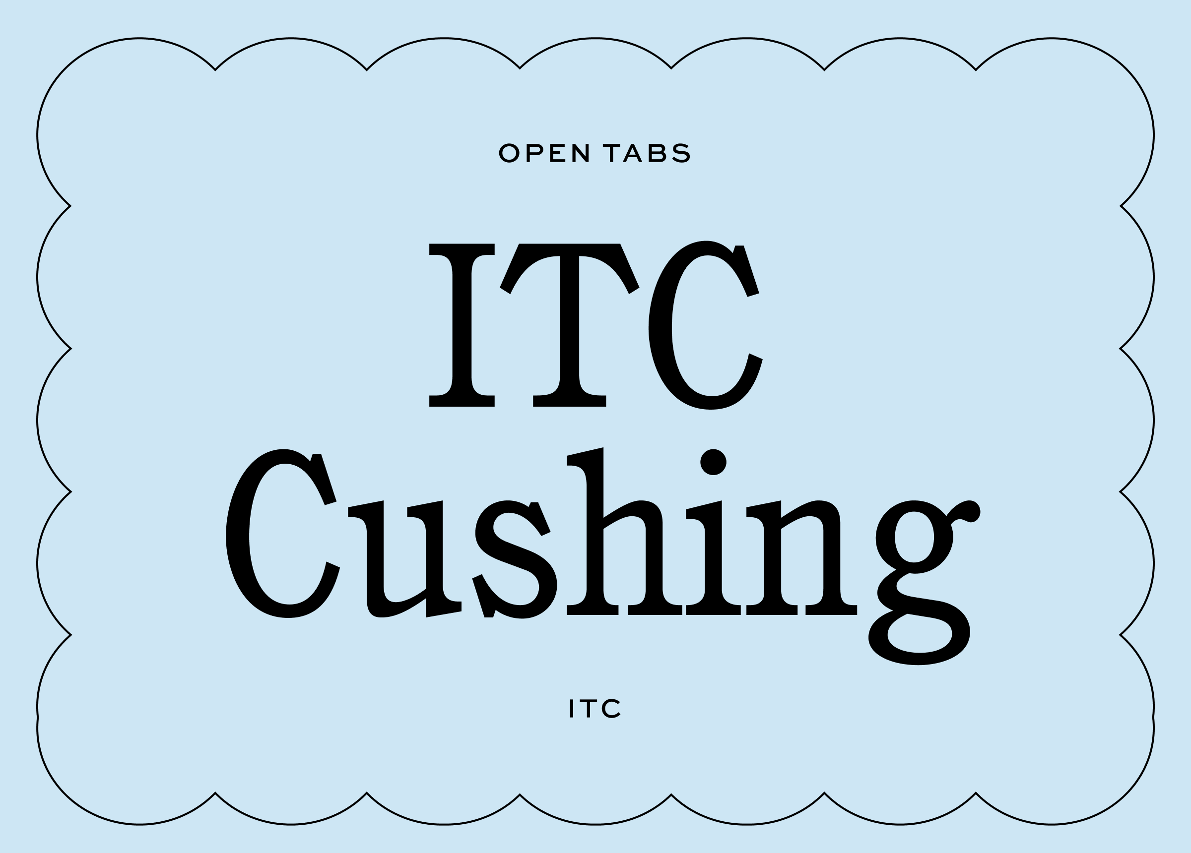
In redesigning our own website at Shoppe Theory, we jumped ship from ITC Garamond to ITC Cushing at the 11th hour and have no regrets. This was inevitable as ITC Cushing has just the thing that makes me go ga-ga for a typeface: A timeless look with a splash of je-ne-sais-quoi quirk. I think it comes from the weight and shapes of the serifs. To me, they verge on feeling a bit clunky for the screen but when paired with the classic, elegant letterforms, give this typeface its sense of understated yet distinct confidence and style.
02. Platform
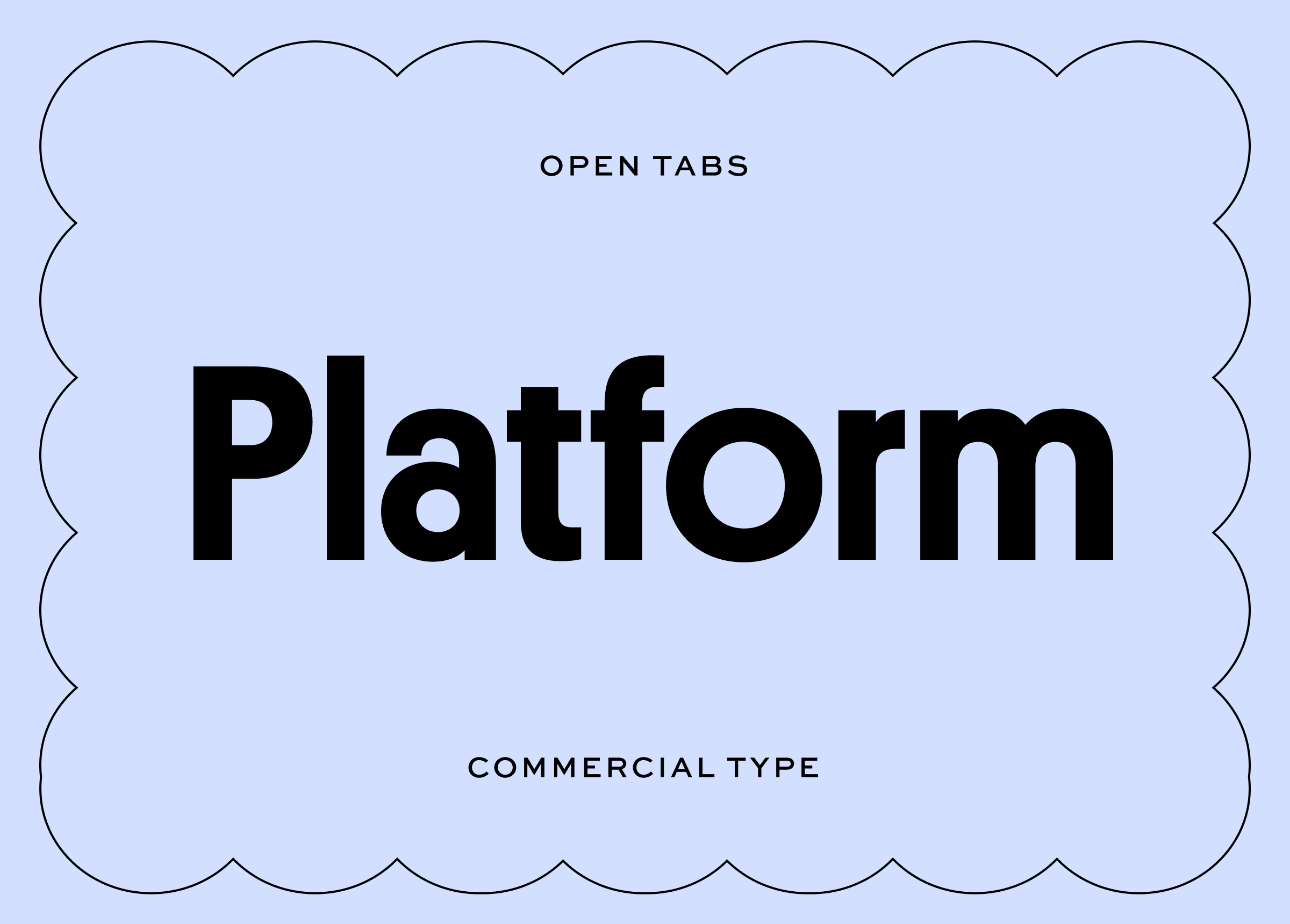
I actually had to double check that I didn’t already have Platform in one of my past font roundups on Instagram. It. is. so. good. For a hot second, we considered using it as the primary typeface for our own brand identity at Shoppe Theory (though ITC Cushing won out).
To me, Platform feels deliciously retro yet contemporary. The lines and proportions of the letterforms exude just the right amount character without sacrificing legibility. For how fun the font is, it’s surprisingly flexible and usable. If you’re looking for a sans-serif to amplify the character of your visual identity, give Platform a whirl.
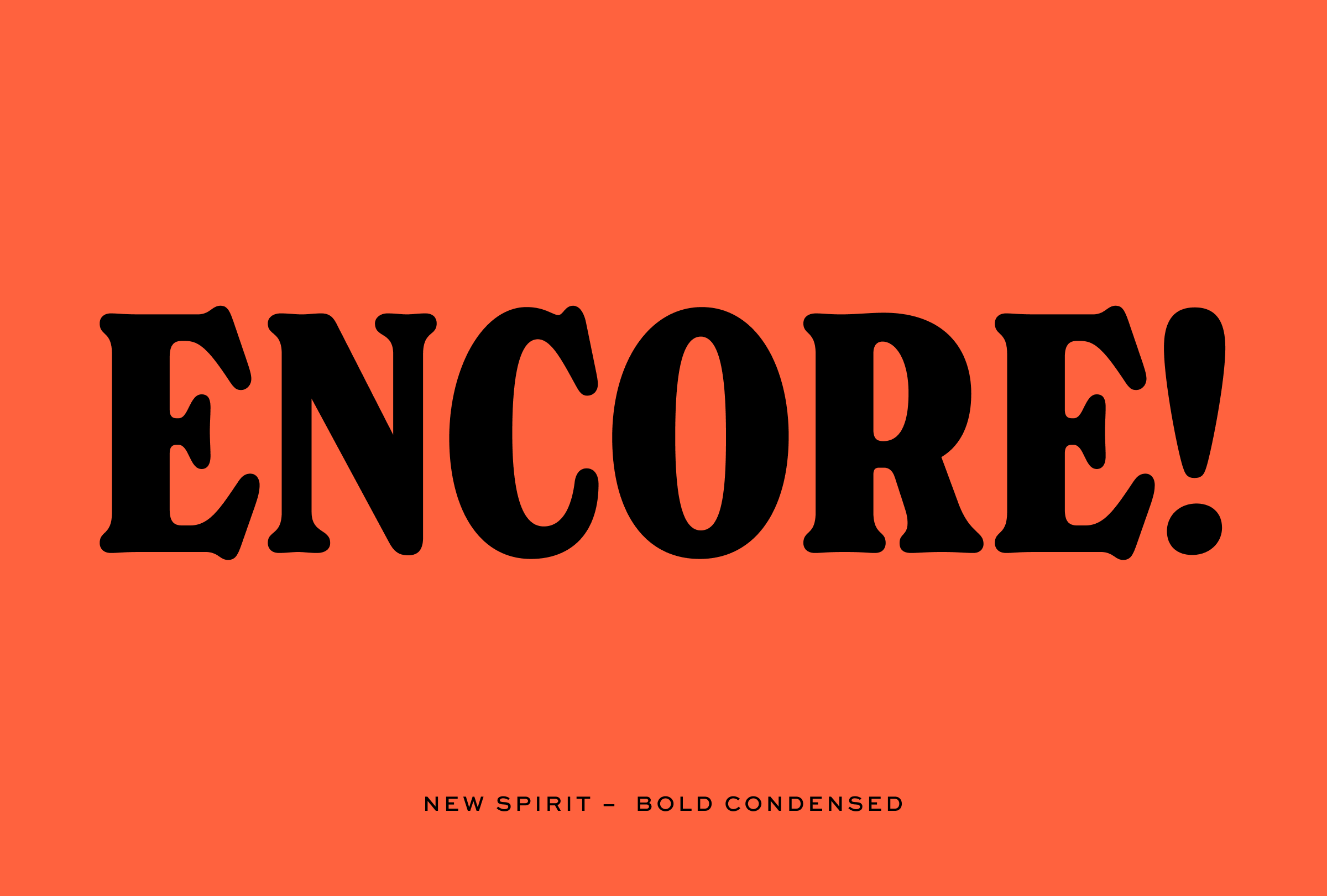
03. New Spirit

I spent a good chunk of time this month researching type for a brand identity project with a ‘nostalgic’ vibe, which brought me to New Spirit.
New Spirit is a revival of Windsor, a typeface release in 1905. While I’m not a type designer, I so appreciate the work that goes into reinterpreting an iconic typeface and releasing a set of fonts for today’s use.
I found myself particularly fond of the condensed styles. I’m always on the hunt for a typeface that has personality without being overpowering and New Spirit is just that.

I also really like how New Spirit looks in all caps. It commands attention in a playful way, and I could see myself using New Spirit in all caps to create sub-headings or call-outs in a type system.
04. Instrument Serif
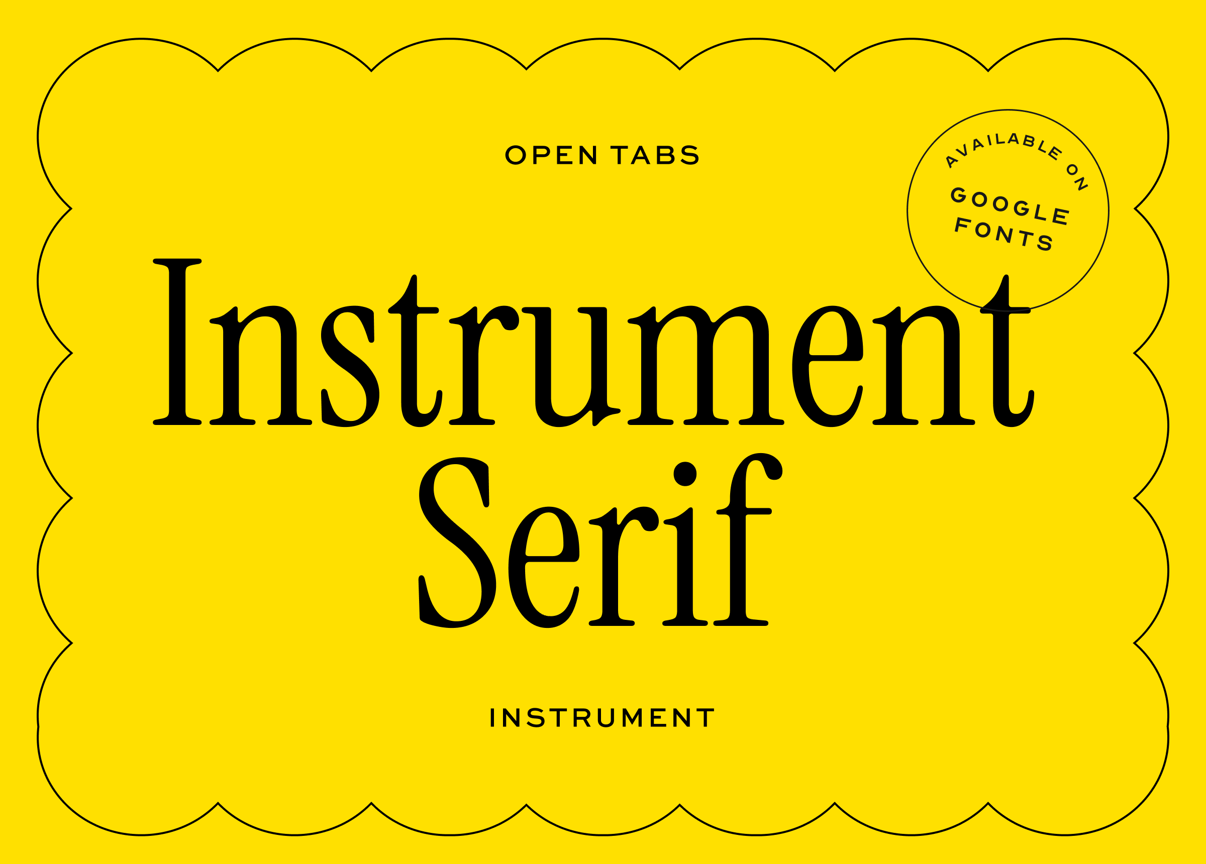
I’ve said it before, and I’ll say it again: nothing tugs at my heartstrings like a really good, condensed serif typeface. And Instrument Serif is very good and very free. It reminds me a lot of Editorial New from Pangram Pangram which I used on my portfolio site.
Yes, Instrument Serif only comes in 1 weight and 1 style, but I would go as far as to say that it is currently my favorite serif typeface on Google Fonts. In other words, you should download it and add it to your font collection ASAP.
Ok, welp! That concludes this month’s Font Roundup! Until next time.
Coming up on Open Tabs: Finding design inspiration in farm trash. Subscribe if you like this sort of thing and you’ll get the next issue in your inbox ♡
new spirit is our fav!
Love these specimens!!! You are the ultimate font collector, exquisite taste!!